

Article Summary
A Pivot Table in Excel is a built-in tool that summarizes, organizes, and analyzes large datasets without formulas. This article covers key functions: deduplication, counting entries, error-checking, grouping, and custom layouts. Readers will gain a clear understanding of what Pivot Tables do and why they're essential for faster, smarter data analysis.
If you work with spreadsheets regularly, PivotTables can transform how you create data analysis. They might sound scary, but they are quick to set up, and have a lot of built-in functionality. In this guide, you’ll learn what PivotTables are, how they work, their key benefits, and how to create one in less than a minute.
Whether you’re new to Excel or looking to level up your skills, if you haven’t created a PivotTable before, this is for you.
What is a PivotTable?
A PivotTable is an interactive Excel feature that summarizes small or large amounts of data into a compact, customizable report without requiring formulas or complex functions.
The name “PivotTable” comes from the ability to “pivot” or rotate your data. You can take information that runs down a column and turn it into headers that run across the top of your report. This flexibility lets you view the same data from multiple angles. Or you can have one category going down, another category going across (pivotted), and the values in the middle.
PivotTables work best with tabular data – think rows of records with consistent column headers. Your source data can be a few dozen rows or hundreds of thousands. The more data you have, the more valuable PivotTables become for spotting patterns you’d never catch by scrolling through raw numbers.
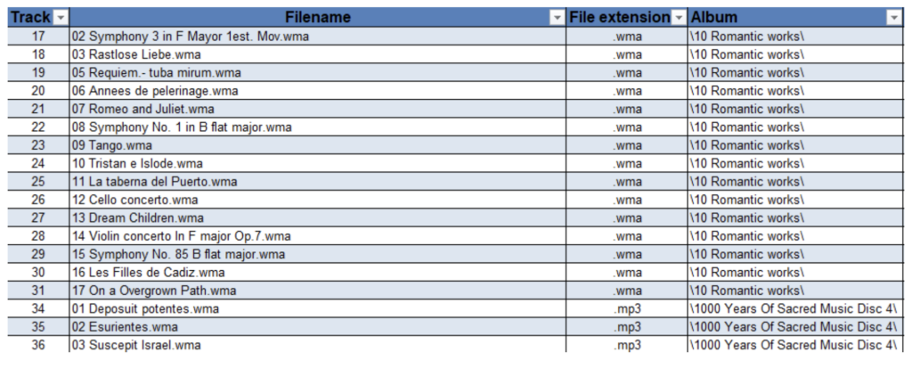
For example, if you have 253 rows of sales transactions, a PivotTable can instantly show you total sales by region, by product, by month – or all three at once. You drag and drop fields to build exactly the summary you need.
How PivotTables differ from regular Excel tables
If you’ve used Excel Tables before, you might wonder how PivotTables are different. Here’s a quick comparison:
| Feature | Excel Table | PivotTable |
| Purpose | Organize and format raw data | Summarize and analyze data |
| Data manipulation | Sort and filter rows, and add calculated columns | Aggregate, group, and add calculated measures |
| Formulas required | Often needed for analysis | Built-in functionality – no need for formulas |
| Dynamic updates | Yes, with structured references | Manual refresh required |
| Best for | Storing and managing data | Reporting and insights |
| Learning curve | Starts simple, but can get much more complicated | Sounds scary, but once you have created one, becomes a lot easier |
Think of an Excel table as your organized filing cabinet. A PivotTable is the report you generate from those files – it pulls together the information you need without changing the original data.
Key components of a PivotTable
Every PivotTable is built from four field areas. Understanding these helps you create exactly the analysis you need.
Filters, columns, rows, and values explained
When you create a PivotTable, you’ll see a Fields pane with four areas where you can drag your data columns:
- Rows: Create labels that run down the left side. This is often where you place your main categories, like product names, regions, or employee names.
- Columns: Create headers that run across the top of your table. Useful for time periods (months, years) or categories you want to compare side by side.
- Filters: Narrow down the entire PivotTable to show only specific data. For example, filter to show only Q4 results or only one product category. Similar functionality also exists using the filters in the columns and rows, or using a slicer or timeline.
- Values: The numbers you want to calculate – sums, counts, averages, or other aggregations. This is the heart of your analysis.
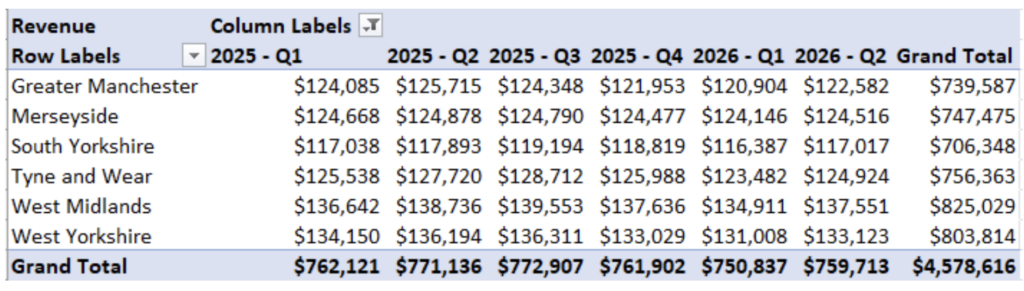
For instance, if you’re analyzing sales data, you might put “Region” in Rows, “Quarter” in Columns, and “Revenue” in Values. Instantly, you’d see total revenue by region for each quarter.
Benefits of using PivotTables
PivotTables offer several advantages that make them essential for anyone working with data in Excel:
- Save time: Create analyses in seconds that would take much longer with formulas. What might require multiple COUNTIF or SUMIF functions happens with a simple drag and drop.
- Skip complex formulas: You don’t need to write complex formulas or array functions. PivotTables handle the calculations automatically. Because of this, it also removes the possibility of mistakes with inconsistent formulas.
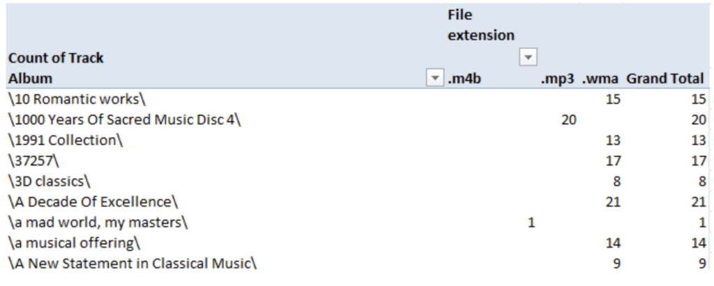
- Remove duplicates easily: Need a unique list from data with repetitions? A PivotTable instantly shows each value only once. If you have 253 rows from 20 different albums, you’ll see those 20 albums listed quickly.
- Catch errors and typos: Spot data quality issues quickly. If “a musical offering” and “a musical ofering” both appear, you’ll see them as separate entries, making the typo obvious.
- Find patterns: Identify trends and correlations that would be invisible in raw data. See which products sell best in which regions, or which months drive the most revenue.
- Generate quick reports: Create presentation-ready summaries without manual formatting. Add conditional formatting for visual impact. And change the fields you are using swiftly.
- Support better decisions: When you can see your data clearly summarized, you can make more informed choices.
When to use a PivotTable
PivotTables shine in many common scenarios:
- Analyzing sales data by product, region, or time period,
- Tracking inventory levels across multiple locations,
- Reviewing survey responses to find trends,
- Finding duplicate or inconsistent entries in your data,
- Creating monthly or quarterly reports for stakeholders,
- Comparing performance across teams or departments, and
- Exploring new datasets to understand what’s in them.
If you find yourself asking “how many,” “what’s the total,” or “how does X compare to Y,” a PivotTable is likely your fastest path to an answer.
How to create a PivotTable in Excel
Creating a PivotTable takes just a few steps:
- Select your data (including headers).
- Go to the Insert tab and click PivotTable.
- Click OK to create the PivotTable on a new worksheet.
- In the PivotTable Fields pane, drag fields into the Rows, Columns, and Values areas.
After you click OK, a new spreadsheet appears with a blank PivotTable and the PivotTable Fields pane.
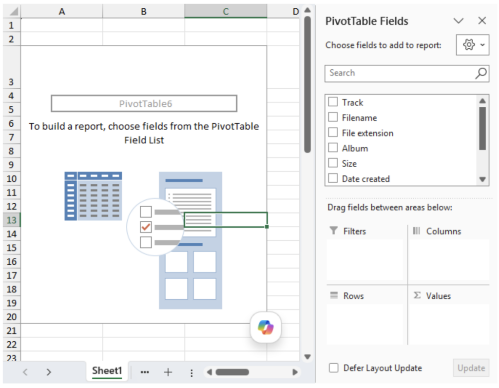
Drag a field like “Album” into the Rows area, and you’ll immediately see a deduplicated list. Add the same field to Values, and you’ll see how many times each album appears, as shown near the beginning of this article.
Not sure where to start? Go to Insert > Recommended PivotTables. Excel will suggest analyses based on your data structure. This works especially well with sales or transactional data.
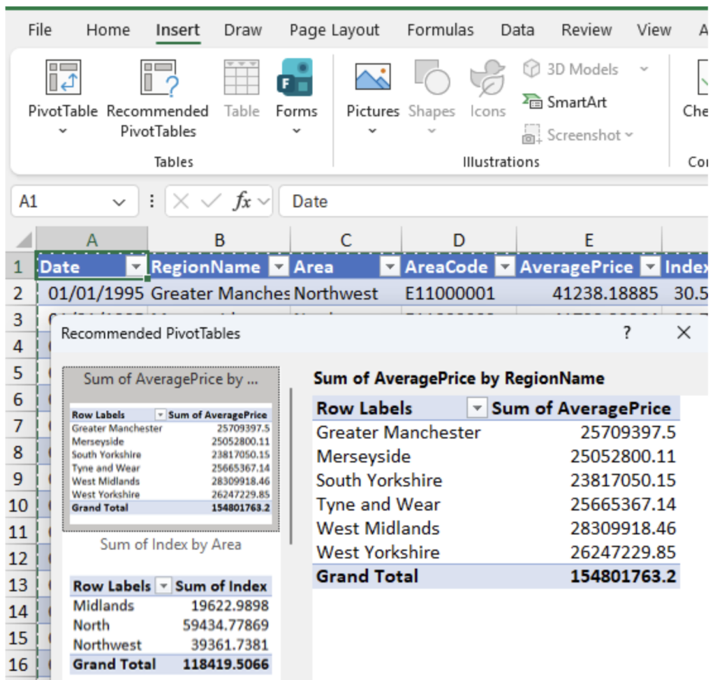
One important note: PivotTables don’t update automatically when your source data changes. To refresh your analysis, right-click on the PivotTable and select “Refresh,” or go to PivotTable Analyze > Refresh.
Customizing your PivotTable layout
Excel offers three layout options for viewing your PivotTable, which you can access through PivotTable Design > Layout. The differences are more obvious when you have multiple fields in the Rows area:
- Compact Form (default): All row fields appear in a single column labeled “Row Labels.” Most space-efficient, but can be more confusing.
- Outline Form: Each row field gets its own column, with subtotals above the data.
- Tabular Form: Each row field gets its own column, with subtotals below the data. Often the clearest for reports.
You can also add conditional formatting to make patterns pop. Highlight your values, go to Home > Conditional Formatting > Data Bars, and choose a color scheme. This adds visual bars that show relative values at a glance.
FAQ
What data format works best for PivotTables?
PivotTables work best with tabular data that has column headers in the first row and no blank rows or columns within the data range. Each column should contain one type of information, and each row should represent one record.
Can you format PivotTables?
Yes, there are a lot of different ways that you can format PivotTables. You can go into PivotTable Design to change the overall style, including the layout. You can go into PivotTable Analyze to insert slicers and filters. Finally, you can click on the fields in each area and go to Field Settings to change the aggregation (the summary of values) and its number formatting. For more, see the resources mentioned below.
Take your Excel skills further
Once you’re comfortable with basic PivotTables, there’s much more to explore: calculated fields, slicers for interactive filtering, and building full dashboards. These advanced features can turn your Excel workbooks into powerful reporting tools.
Want to know more? Check out MO-211 prep: Microsoft Excel Expert for training on PivotTables, advanced formulas, and VBA; it also helps you prepare for a Microsoft exam. There’s also a version for Mac users.
If you want to go much deeper, then look at our Microsoft Excel: Pivot Tables, Power Query, Power Pivot/DAX course. Or continue learning with our detailed guide on creating PivotTables, which covers data structure requirements, field settings, and dashboard creation.