
Article Summary
Knowing which of the different kinds of graphs fits your data makes all the difference. This article covers 10 types—bar graphs, pie charts, line graphs, histograms, scatterplots, and more—explaining when to use each. You'll leave knowing exactly which graph best fits your data.
 You know the saying, “A picture is worth a thousand words?” They were probably talking about graphs. Different types of graphs are used for different situations. For this reason, it helps to know a little bit about what the available graphs are. Many times the kind of data is what determines the appropriate graphs to use. For example, in this course called Quantifying the User Experience, graphs would be used to show the quantified results.
Graphs are picture representatives for 1 or more sets of information and how these visually relate to one another. There are many types of charts and graphs of varied complexity. For almost any numerical data set, there is a graph type that is appropriate for representing it. Graphs help you present data in a meaningful way. It is one thing to see a data listed on a page and it’s another to actually understand the details and trends of the data. A lot of the time, sets of data involve values in the millions or billions. This is far too many to print out in a magazine or journal article. Using a graph can help depict data and a well-made graph conveys information quickly. Here is a course called Introduction to Statistics that shows you how graphs are used to display data.
Bar Graphs
Also known as a Pareto Diagram, a bar graph can be horizontal or vertical. Each axis is labelled with either a categorical or a numerical variable. The bars’ heights are scaled according to their values and the bars can be compared to each other. Bar graphs can be drawn in a 3-dimensional way and compiled for data comparison about the same thing or location. So that more important categories are emphasized, bars in a bar graphs are arranged in order of frequency.
Flow Charts
A flow chart displays schematic processes based on the outcome, validity, or answer to a previous variable. Each of the flow chart’s shapes represents specific actions and the legend codes are included to inform you. Flow charts consist of inputs and outputs, a start point and an end point that basic symbols represent.
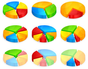
Pie Charts
Sometimes called a circle graph, pie charts represent the parts of a whole. Each ‘section’ or ‘slice of the pie is a data percentage. From biggest to smallest, segments are arranged in a clockwise formation. This way, the pie chart features easy-to-compare subjects presented in a neat, easy-to-understand way.
Pictograph
These are the first graph types that kids learn about. In pictographs, smaller picture represents a certain amount of an item and the pictures in the graphs are stacked up one after another. Picture fractions represent the portions represented by the picture. If an approximation would be estimated or given, the pictograph is used for representing these amounts visually.
Line Graphs
Used to display comparisons between 2 variables, line graphs involve an x-axis horizontally and a y-axis vertically on a grid. Dot-connected and grid-plotted lines are what comprise a line graph. These lines monitor and compare various data sets. Usually, the x-axis represents time measurements while the y-axis is a representative of measure or percentage of quantity. For this reason, a line graph is used often for tracking variables of one or more subjects in time.
Time Series Graphs
Data is displayed in a time series graph at various time-points. This is another type of graph used for specific kinds of data that come in pairs. The vertical axis is for data values while the horizontal axis shows time. This kind of graph can be used for showing trends passing through a time period.
Stem and Leaf Plot
Stem and leaf plots break quantitative data value into 2 pieces. Usually, the value with the highest place is represented by the stem and the rest of the values are in the leaf. This type of graph provides a method of listing all values of data in compact forms.
Histogram
When quantitative data is what you have, a histogram would be used to show it. This is a kind of graph that also uses bars. Ranges of values are listed at the bottom and these are called ‘classes.’ Taller bars represent the classes with greater frequencies. You usually use histograms to show information used for statistics, such as in this course called Statistics Made Easy.
Dot Plot
A hybrid between a stem and leaf plot and a histogram, dot plots consist of points or dots that are positioned on top of appropriate class values.
Scatterplot
Scatterplots display paired data using the vertical or the y axis and a horizontal axis or the x axis. The tools for statistics called correlation and regression are then used for showing trends on this type of graph.
Other Graphs
What if your data does not work on any of the graphs mentioned above? Even if this list shows you the most popular graphs available, it is not the entire list. There are other graphs out there that are even more specialized and you will for sure find the one you need sooner or later. You might also want to consider the fact that there may come a time when the graph you need has not been invented just yet. At one point, for example, no one used bar graphs since these did not exist. Currently, however, bar graphs are in spread sheet programs like Excel, relied on by hundreds of companies. If you want to display data that you have, using your imagination and creating a graph for it may be just the thing. This way, data is visualized in a new way and who knows, this may work the way bar graph inventions did. Here is an article you might like about how to create graphs using Excel.
Did this help? For more information about the applications of graphs, here is a course called Workshop in Probability and Statistics where you can get a first-hand glimpse of which graph is used with which type of information.