
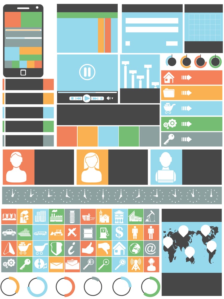
Article Summary
UI design patterns are reusable interface solutions—like breadcrumbs, top menus, and progression bars—that make websites intuitive and user-friendly. This article covers nine essential UI design patterns, from easy registration forms to hover controls. You'll gain a practical understanding of which patterns improve usability and why they matter.
 As a web developer and design lackey, I really appreciate a well-put together website. There is nothing more frustrating than trying to register for a site when they ask you for all of your personal information and you don’t even know what it is you’re getting yet.
It’s also a bummer when the site design isn’t as intuitive as it should be. We know, as internet users, that usually your account profile on a website includes everything like billing, prior transactions, reviews, feedback, or whatever. When a site makes you have to hunt to perform simple functions it becomes frustrating for the user and likely acts a deterrent for them to be repeat visitor. User interface (UI) is incredibly important to the success of your business or venture.
Avoid a design calamity and pay attention to these vital UI design patterns. Learn how to develop effective and high traffic sites from the ground up in this design fundamentals course.
1. Breadcrumbs
These are the best. When you are on a site that has a hierarchy of levels like Store > Women > Accessories > Belts it’s good to know what page you are viewing and how exactly you got there. Using breadcrumbs fixes this by putting indicating showing you the pages you clicked on to get to the page you are currently viewing. Usually the bread crumbs will appear above the main body of the content.

2. Top Menu and Search
Top menus are just better. Sometimes, for certain applications (Mail clients, music players, etc. ) it’s nice to have a left or right side menu. On websites it is more viewer friendly to maintain a top menu, with dropdowns if need be, along with a search bar. I don’t know about you, but the first place I look on a website to search is the top right corner. Not the sidebar, not in the footer. These simple adjustments to your page can really enhance the experience of your audience. In this designing web interfaces masters class you can learn from the experts about how to maximize user interface functions.

3. Easy Registration
Keep it simple! People do not want to tell you where they live, their phone number or who their employer is (yes I’ve seen this on registration forms before). All you need from them is a username and password – and in some cases their name. Of course if the site requires monetary transactions and product purchases you are going to want to have a section on their profile for them to update their billing and shipping information. Additionally, make sure that your viewers can actually find where to sign up or register for your site. So often this little link is hidden somewhere in the crevices of a sidebar or blends in with the background as it sits in the top right corner. Don’t make people search for it – they won’t. In usability testing methods you can learn some more tips about making a site intuitive so users find it easy to use and become return users.

4. Primary Actions
In marketing, designers use colors, shapes and sounds to draw consumers in subconsciously. It may sound bonkers but the color green could make someone become a customer whereas the color red may deflect people. The same principle applies when setting up certain functions on your website. If someone decides to register for your site and they have the option to “save” their profile information, or “skip and do it later”, they are most likely going to pick the bigger, more appealing button… regardless. Whatever the “primary” action is you want your viewers to do – make it stand out. Use bright colors and bigger buttons. Often times the “secondary” actions (like cancel or sign up later) can be written as simple links or a dull gray color to dissuade people from choosing it. There really is a psychology behind website design and a design for engagement course can take you through it all.

5. Search Parameters
This is more of a back-end developer deal, but there is also a portion that is under the designer’s control. Make the search function on your site friendly for everyone. Don’t have such tight controls like you have to enter only a city WITH a zip code to get results. Set it up so your customers can search using the state, city or zip code. It will reap bigger benefits for you and be much less frustrating for users.

6. Required Fields
Really, this just saves you trouble in the long run. If you don’t identify fields that you need filled out – people will probably not fill them out. This can be problematic when you need to ship a product and there is no shipping address. Indicate which fields are required to be filled by marking them with an asterisk or even just the caption “required”.

7. Step-by-Step (Progression Bar)
If you have a lengthy registration process, or are administering some sort of questionnaire or application, let the users know where they are in the process. It just lets your user know how much time the can expect to spend filling out information, what information may be required and it’s just good UI design practice.

8. Your vs. My
When you sign into accounts like on Amazon or Etsy you will notice that it welcomes you by your name. The site design also uses the “your account” vs. “my account” approach. UI designers do this to build a sort of rapport with the users. It’s like a friend would speak to you, it’s your account and your profile. Not mine. Some cases “my” is appropriate read more about that in a conversational interface.

9. Hover Controls
You know on Facebook how you can just hover over your cover picture and it gives you the option to change or update it? That is a hover control. Facebook uses it all over the site and a lot of other sites are starting to incorporate this design pattern into their interface. It makes for easy user control without feeling cluttered with all the “edit” “change” and “update” buttons everywhere.

Some of these design elements may seem like a no-brainer because you’re used to using other websites with similar features every day. Some, however, may escape you which hopefully this article has helped give you new insight on what to include on your next web design project. For more professional advice on how to make your site the ultimate user friendly experience check out this user experience course.