
Article Summary
Running a linear regression example in Excel means using the Data Analysis ToolPak to model relationships between two variables. This article walks through slope, intercept, and prediction using student study hours and grades. You'll gain the skills to run and interpret regression output confidently in Excel.
 Statistical analysis is the basis of modern life. Statistical analysis has allowed us to create powerful medicines that cure disease. They have allowed us to create cars that are safe, products that meet our needs and corporations that offer services that people only dreamed about a century ago. Almost every organization today uses statistical analysis to ensure profitability. And yet most people feel that statistical analysis is intimidating. This article will show you how simple and practical statistics can be by illustrating a simple linear regression example. The Introductory statistics, Part1: Descriptive Statistics will teach you how to use descriptive statistical analysis techniques so that you can summarize and analyze your own data.
Simple linear regression is a technique that displays the relationship between variable “y” based on the values of variable “x”. In simple terms we use linear regression relationships all the time in our own lives. We know as the temperature drops people put on more jackets to keep warm or as the gas price increases more people drive less to save money. In fact, economists rely on these relationships to manage the economy by increasing bank rates to discourage lending for example.
This example will explain linear regression in terms of students and their grades. Take a look at the following spreadsheet example: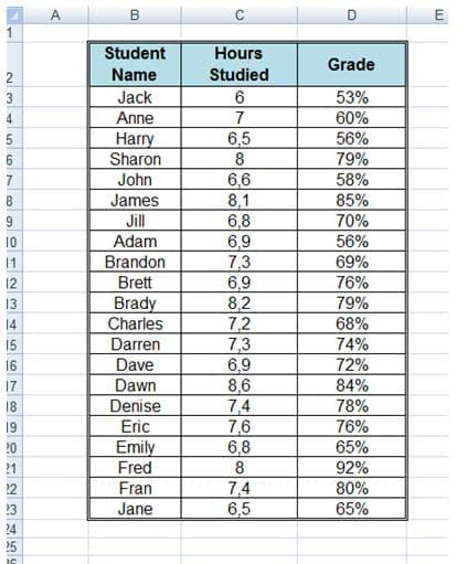
This spreadsheet shows the number of hours a student studied and the grades achieved by the students. If we use a graph to represent the above table it would look like this: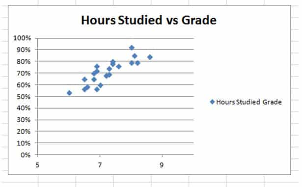
The graph displays a definite upward trend indicating that the more hours a student studies, the more likely the student is to achieve a better result.
How to Calculate Linear Regression
A regression in statistics is statistical analysis that assess the relationship between two variables. The calculation is used to determine the relationship between two variables. In our example, we need to determine the relationship between hours studied and grades achieved so that we can calculate what grade a student will achieve if they study for 9 hours for example.
What we are really looking for is a line that represents the average of the data above on the graph. We could add a line to the graph manually, but the results would not be as accurate as actually calculating the relationship.
The Equation for regression can be expressed as follows:
Regression Equation(y) = a + bx
Slope(b) = (NΣXY – (ΣX)(ΣY)) / (NΣX2 – (ΣX)2)
Intercept(a) = (ΣY – b(ΣX)) / N
Where:
x and y are the variables.
b = The slope of the regression line
a = The intercept point of the regression line and the y axis.
N = Number of values or elements
X = First Score
Y = Second Score
ΣXY = Sum of the product of first and Second Scores
ΣX = Sum of First Scores
ΣY = Sum of Second Scores
ΣX2 = Sum of square First Scores
The course in Probability and Statistics will take you through a step by step tutorial on how to calculate linear regression. The workshop will teach you probability, sampling, regression, and decision analysis and by the end of the workshop and you should be able to pass any introductory statistics course.
Our Linear Regression Example using Excel
Excel offers a number of different functions that allow us to statically analyze data. To create a regression analysis of the above data, we need to select the “Data Analysis” option from the “Data” tab: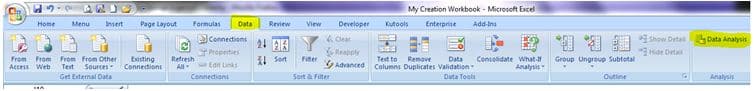
Then select “Regression” from the Data Analysis options: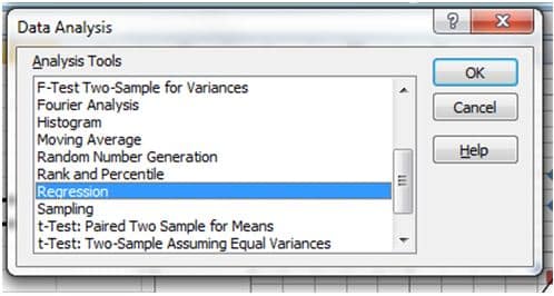
Now all you need to do is indicate the x and Y values and indicated the output and chart type you want to draw: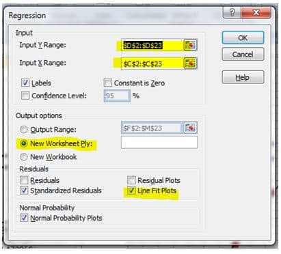
Excel will perform the regression analysis for you and you will end up with a graph like this in the new worksheet to represent the linear regression:
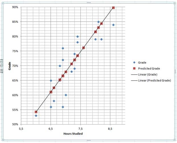
Now we can use the graph to make predictions about grades depending on how long a student studies for a test: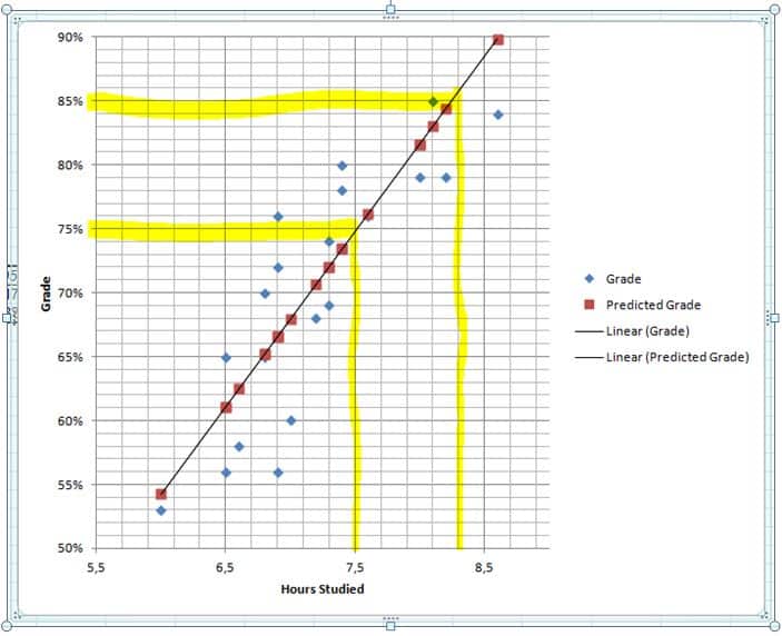
Using the graph we can predict that a student who studies for about 7 and a half hours should get a grade of about 75% for this test and a student who studies for about 8.3 hours should get a grade of about 85%.
Practical Statistics
We’ve used a simple example to show you how simple statistics can be, but statistics are becoming more and more important to ensure businesses make the right decisions to remain profitable. Statistics are used to determine which adverts are best, what products will succeed and how a company should spend its money. As companies realize the power of the internet, they are also realizing that user experience of their products can severely impact their profit margins. Statistics are therefore being used to ensure optimum user experience too. The Practical Statistics for The User Experience I course offers easy to understand concepts and lots examples that will help you generate statistical solutions to common questions in user research.