

Article Summary
Data storytelling is the practice of combining data, narrative, and visuals to explain not just what happened, but why it matters and what to do next. This article covers its four core components, how it differs from data visualization, real-world examples, and key skills to develop. Readers will gain a clear, practical understanding of data storytelling and why it's becoming an essential skill across industries.
You’ve spent hours building the perfect chart. The data is clean, the colors are on point, and every axis is labeled. But when you present it, your audience nods politely and moves on without acting on a single insight. What’s often missing isn’t better data or cleaner charts — it’s a clear story around them.
But one skill is becoming increasingly valuable across industries: data storytelling. It’s appearing in job postings, team presentations, and the way organizations make decisions. And it’s not reserved for data scientists. Whether you’re a marketer analyzing campaign performance, a business student preparing a case study, or a career changer exploring analytics, data storytelling is one of the most practical skills you can develop today.
In this article, you’ll learn what data storytelling is, why demand for it is surging, the core components behind every effective data story, and how to start building this skill on your own terms.
What is data storytelling
Data storytelling is the practice of weaving together data, narrative, and visuals to communicate insights in a way that drives understanding and action. It goes beyond charts and dashboards by adding narrative context and a clear takeaway. Instead of showing people what happened, a data story helps them understand why it happened and what to do next.
That might sound similar to data visualization, but there’s an important distinction. Data visualization is the act of representing data in charts, graphs, or maps. A chart shows numbers. A data story explains why those numbers matter and what happens next.
Similarly, a data report lists metrics, but a data story gives those metrics meaning through context and structure.
There’s also an emotional dimension that’s easy to overlook. As author Nancy Duarte puts it in her book Resonate, “You can have piles of facts and still fail to resonate. It’s not the information itself that’s important but the emotional impact of that information.” The best data stories don’t just inform; they make the audience feel why the numbers matter, whether that’s urgency, opportunity, or risk. That feeling is what turns understanding into action.
Consider this scenario. Imagine you’re a marketing analyst and your team’s email open rates have been declining for three months. You could share a bar chart showing the drop. Or you could tell this story:
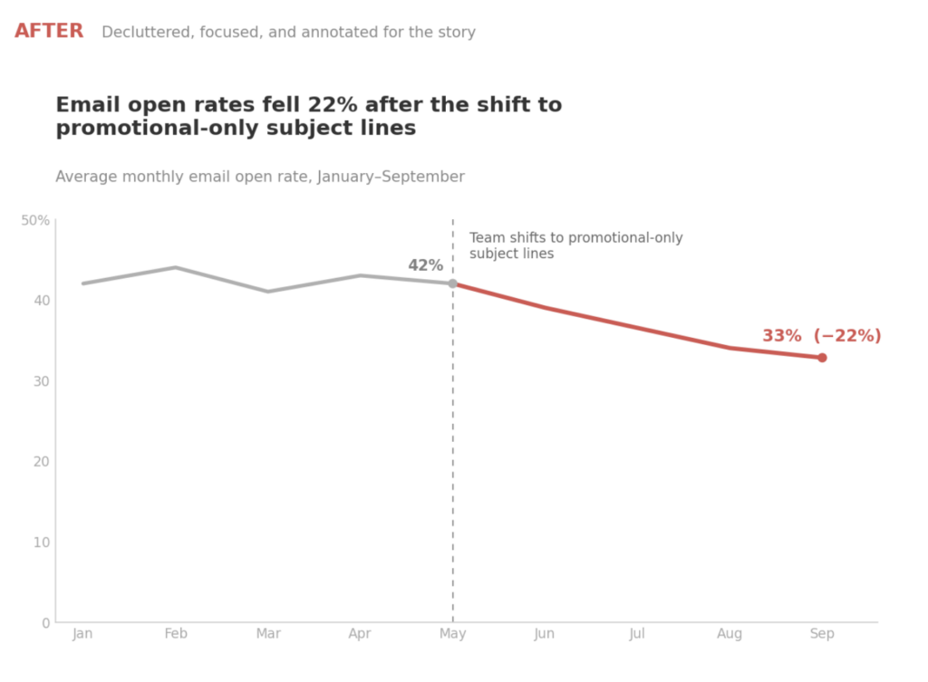
“Open rates fell 22% after the team shifted to promotional-only subject lines, the top three performing emails all used curiosity-driven headlines, and here’s a two-week A/B test plan to recover.”
The second version is data storytelling; it transforms numbers into a narrative that leads to a decision. But the words are only half of it. Data storytelling is at its best when written or verbal narrative and visuals work together, and that means the chart itself has a story to tell.
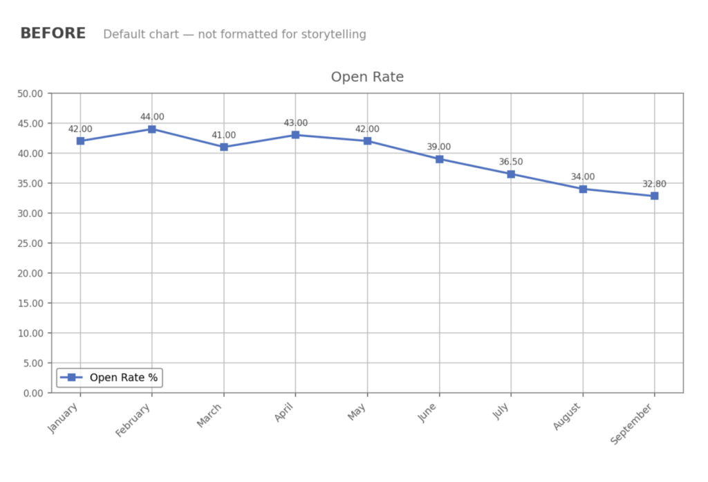
The example below shows the same open-rate data twice. The “before” version is what most tools produce by default: gridlines, data markers, a label on every point, and no point of view. The “after” version uses color to create a single focal point, an annotation to mark the moment the subject lines changed, and a title that states the insight rather than the metric.
Pair that chart with the narrative above and your audience doesn’t just see the data, they see the decision.
One more thing worth remembering: data storytelling is not a tool or a piece of software. It’s a communication skill that transfers across industries and experience levels. That makes it something you can start practicing today, regardless of the tools you currently use.
Why data storytelling is becoming so popular
If you work with data in any capacity — even occasionally — you’ve probably noticed that “storytelling” keeps appearing in job descriptions, conference talks, and team expectations.
That’s not a coincidence. Several shifts are driving demand for this skill right now.
- Data democratization. Self-service analytics tools like Metabase, Flourish, Tableau, Power BI, and Google Looker have put data into the hands of non-technical professionals. More people have access to data than ever before, but fewer know how to communicate what it means. The ability to turn a dashboard into a clear narrative is increasingly what separates useful analysis from noise.
- AI and automation. As AI handles more data collection and analysis, the human skill that remains difficult to automate is interpretation, or framing findings in context and persuading others to act on them. The World Economic Forum’s Future of Jobs Report 2025 projects that 39% of workers’ core skills will be disrupted by 2030, with analytical thinking and technological literacy topping the list of growing demands.1 Data storytelling sits at the intersection of both.
- Remote and async work. Distributed teams rely on written and visual communication. A well-structured data story travels better in a Slack thread, a recorded presentation, or a shared document than a live walkthrough of a spreadsheet. If your audience isn’t in the room, your data needs to speak for itself.
- Growing employer demand. Data storytelling now appears in job postings for analysts, marketers, product managers, and consultants, not just data scientists.2
The four key components of data storytelling
Every effective data story rests on four building blocks. Understanding them gives you a framework you can apply to any insight, in any context.
1. Data: The foundation
Credible, relevant data is the starting point. Without it, you’re telling a story, but not a data story. What matters here is quality: your data should be clean, accurate, and directly relevant to the question you’re trying to answer.
You don’t need “big data” or enterprise-grade datasets to do this well. Even a simple survey, a month of website analytics, or a well-organized spreadsheet can fuel a powerful data story, as long as you trust the numbers behind it.
2. Narrative: The structure
A narrative gives your data a beginning, middle, and end.
- The beginning sets the context: why does this matter?
- The middle presents the insight: what does the data reveal?
- The end closes with a recommendation for what should happen next
This structure is what separates a data story from a dashboard. It answers the two questions your audience is always asking: “So what?” and “Now what?”
Classic storytelling frameworks — like situation, complication, and resolution — translate surprisingly well to data presentations.
3. Visuals: The clarity
Charts, graphs, and diagrams make abstract data concrete. The goal isn’t decoration, but clarity. The right visual makes your insight obvious at a glance. A line chart works for trends over time. A bar chart is better for comparisons. A heatmap highlights patterns in dense data. The key is choosing the visual that supports your narrative rather than replacing it.
4. Medium: The delivery
Data, narrative, and visuals still need a vehicle to reach your audience, and choosing it is part of the storyteller’s job. The same insight might be delivered as a Slack message, a slide deck, an emailed report, a BI dashboard, or an interactive web page, and each carries different expectations for depth, polish, and interactivity.
The right choice depends largely on whether your story will be told synchronously, with you in the room guiding the audience, or asynchronously, where the story has to stand on its own and annotations and context do the talking.
A brilliant chart in the wrong medium — a dense dashboard sent to a time-pressed executive, say — will fail just as surely as a bad chart. So before you share anything, ask: where will my audience actually consume this, and does my story work there?
How to tell a story with data
Knowing what data storytelling is and actually doing it are two different things. Here’s a six-step framework you can use to build any data story, whether you’re presenting to your manager or writing a report for stakeholders.
1. Start with a question
Every data story begins with a clear question your audience cares about. Not “what does the data say?” but something specific: “Should we change our pricing strategy?” or “Which marketing channel is driving the most conversions this quarter?”
The question anchors everything that follows.
2. Gather and clean your data
Pull together the data that can answer your question. This might mean exporting a report, querying a database, or consolidating numbers from multiple sources. Remove outliers, fill gaps, and verify that you trust what you’re working with.
If the data is unreliable, the story falls apart.
3. Find the insight
Analyze the data until you find the answer, or the most interesting pattern. This is the “so what?” that your story will communicate. Sometimes the insight is expected and confirms a hypothesis. Sometimes it’s a surprise. Either way, it should be specific enough to act on.
4. Build the narrative
Structure your findings by framing the context (why does this matter?), walking through the evidence (what does the data show?), and closing with a recommended next step. Think of it as framing: you’re not dumping data on your audience; you’re guiding them through a logical sequence that leads to a conclusion.
5. Choose visuals that support the story
Select charts and layouts that make your insight obvious. Remove anything that doesn’t serve the narrative — extra gridlines, unnecessary legends, decorative elements. Every visual element should earn its place by helping the audience grasp the insight faster.
The important thing is that you can adapt this framework to any context: a five-minute team update, a quarterly board deck, or a long-form written analysis.
Want to create dashboards that inform and stories that persuade? Learn the data visualization and storytelling techniques used by top analysts in The Complete Data Visualization & Storytelling Bootcamp, the Udemy course I created with Lisa Shiller.
6. Format for clarity and focus
Building the right chart isn’t the final step, it’s presentation and formatting. This is the polish stage that information designers like Cole Nussbaumer Knaflic teach:
- Declutter by stripping away unnecessary borders, gridlines, data markers, and anything else that doesn’t carry essential information.
- Then use color and contrast deliberately to create focal points for your readers.
- Finish with an action-oriented title that states the insight rather than the metric, and annotations that explain the “why” directly on the chart.
Done well, your audience should grasp the story in seconds, even when you’re not in the room to walk them through it.
Data storytelling examples you can learn from
The best way to understand data storytelling is to see it in action. Here are three scenarios across different fields; each one illustrates how the same framework turns numbers into decisions.
Data Storytelling in Marketing
A social media manager notices that Instagram engagement has been dropping for six weeks. Instead of sending a spreadsheet to the team, they build a data story:
“Our engagement fell 18% after we shifted to product-only posts. Here’s a comparison of engagement rates by content type over the past quarter, and here’s a two-week test plan that reintroduces educational and behind-the-scenes content.”
The story doesn’t just show the decline — it explains the cause and proposes a next step.
Data Storytelling in Healthcare
A hospital administrator uses patient wait-time data to tell a story about staffing gaps during peak hours. By showing that average wait times spike between 10 AM and 1 PM on weekdays — alongside staffing levels during those same hours — they make a compelling case for a schedule adjustment.
The result: a targeted staffing change that reduces average wait times without increasing headcount.
Data Storytelling in Education and nonprofit
A program coordinator presents to funders using before-and-after enrollment data to show that a mentorship program doubled college enrollment rates among participants over two years. Instead of a raw table, they use a simple line chart with annotations marking key program milestones. The narrative gives funders a clear, evidence-based picture of the program’s results.
The common thread in every example: numbers led to a decision. That’s the core purpose of data storytelling.
Data storytelling tools worth learning
The tools you choose for data storytelling matter less than the skill itself, but having the right ones makes the process easier. Here are the platforms worth exploring, each of which you can learn through data visualization courses on Udemy.
- Tableau: Widely used for interactive visualizations and dashboards. Strong for exploratory analysis and building visual narratives that update in real time.
- Microsoft Power BI: Integrates with Excel and Microsoft 365, making it accessible if you already work in that ecosystem. A solid choice for business reporting and storytelling.
- Python visualization libraries (matplotlib, Plotly, seaborn): Best for learners who want full control over their visuals and are comfortable working in code.
- Google Looker Studio (formerly Data Studio): Free and browser-based; a good starting point if you’re just getting started with data visualization.
- Presentation tools (PowerPoint, Google Slides, Canva): Don’t overlook the delivery layer. The best data story still needs a clear slide or document to land with your audience.
Start with whatever you have access to and focus on storytelling fundamentals first. As your skills grow, you can pick up more specialized platforms through data analysis courses at your own pace.
Data storytelling skills you need to develop
Data storytelling isn’t one skill; it combines analytical thinking with communication ability. The good news is that each one is learnable, and you can build them in parallel.
- Analytical thinking. The ability to look at data, identify patterns, and determine what matters. This is the foundation; you can’t tell a story if you don’t understand the data. Data analysis courses are a practical starting point.
- Narrative structure. Knowing how to organize findings into a beginning, middle, and end that keeps your audience engaged. This is a communication skill, not a technical one, and it improves with practice. You can explore Udemy’s catalog for data storytelling courses to strengthen this skill.
- Visual design. Choosing the right chart type, using color and contrast intentionally, and removing clutter so your visuals communicate clearly. If you want to build this skill, data visualization courses cover both principles and tools.
- Audience awareness. Adapting your level of detail, language, and framing based on who you’re presenting to, whether that’s executives, peers, or clients. The same insight can be told very differently depending on the room.
- Domain knowledge. Understanding the context of the data you’re working with. A marketing analyst and a clinical researcher tell very different data stories, and domain fluency is what makes each one credible.
You don’t need to master all five before you start. Pick a real dataset, ask a question, find an insight, and present it. Practicing with data you already have is one of the most effective ways to improve, and you can build each skill as you go.
Build your data storytelling skills with Udemy
Data storytelling is a skill you can start building today, no matter where you are in your career. If you want to strengthen the analytical side, explore data analysis courses on Udemy. If you’d rather focus on the visual side, data visualization courses cover both the principles and the tools. And if you want to sharpen how you present and persuade, communication skills courses can help you tell a clearer story with any dataset.
Pick one area, start practicing, and let the skill grow from there.
- World Economic Forum — Future of Jobs Report 2025 (https://reports.weforum.org/docs/WEF_Future_of_Jobs_Report_2025.pdf) ↩︎
- Data Storytelling Jobs: Indeed. https://www.indeed.com/q-Data-Storytelling-jobs.html ↩︎